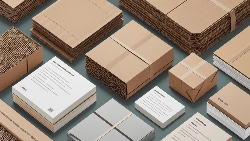
Choosing between glossy and matte finishes for your photos, prints, or packaging can feel tricky. Each finish has unique qualities that affect how your project looks and feels. This guide explains the key differences between glossy and matte finishes, their pros and cons, and when to use each. Whether you’re printing photos, designing packaging, or creating marketing materials, we’ll help you make the right choice.
What Are Glossy and Matte Finishes?
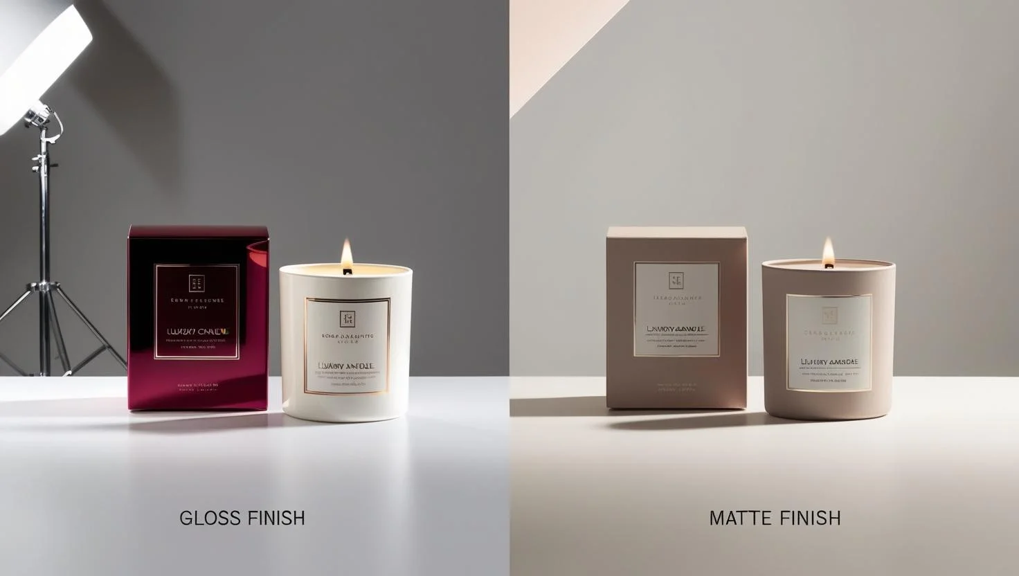
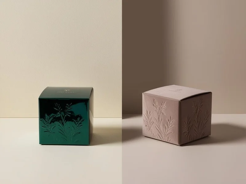
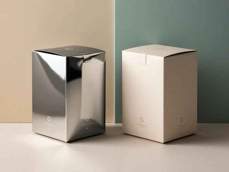
A glossy finish is shiny and reflective. It’s created by adding a special coating to paper or material that reflects light. This makes colors pop and images look vibrant. A matte finish, on the other hand, is non-reflective and smooth. It has a coating that scatters light, giving a softer, more muted look. Both finishes are coated, but they create very different effects.
Key Differences Between Glossy and Matte Finishes
Here’s a breakdown of how glossy and matte finishes compare:
- Appearance: Glossy finishes are shiny and vibrant. Matte finishes are subtle and non-reflective.
- Color Vibrancy: Glossy enhances colors, making them bold. Matte softens colors for a classic look.
- Glare: Glossy reflects light, causing glare. Matte reduces glare, ideal for bright spaces.
- Durability: Both are durable, but glossy resists scratches better. Matte hides fingerprints and smudges.
- Cost: Glossy is often cheaper as it uses less ink. Matte can be pricier due to higher ink absorption.
Glossy Finish: Pros and Cons
Glossy finishes are popular for their eye-catching shine. Here’s what to know:
Pros
- Vibrant Colors: Glossy makes colors pop, perfect for colorful photos or bold designs.
- Sharp Details: It enhances high-resolution images, ideal for fine art or wedding photos.
- Cost-Effective: Glossy prints use less ink, making them budget-friendly.
- Modern Look: The shiny finish feels upscale and professional.
Cons
- Glare Issues: Reflections can make glossy prints hard to view in bright light.
- Fingerprints: Glossy surfaces show smudges and fingerprints easily.
- Not Ideal for Framing: Glass frames add more glare, reducing visibility.
Matte Finish: Pros and Cons
Matte finishes offer a sophisticated, understated look. Here’s a closer look:
Pros
- No Glare: Matte scatters light, making it great for well-lit spaces or framed prints.
- Hides Imperfections: It masks fingerprints, smudges, and minor scratches.
- Classic Style: Perfect for black-and-white photos, sepia tones, or artistic prints.
- Easy to Write On: Matte surfaces are ideal for planners or Custom Packaging with handwritten notes.
Cons
- Less Vibrant: Colors may appear muted compared to glossy.
- Higher Cost: Matte prints often require more ink, increasing costs.
- Less Durable: Matte is slightly less resistant to scratches than glossy.
When to Choose Glossy vs. Matte
Your choice depends on your project’s purpose, display conditions, and audience. Here are some tips:
- Choose Glossy If:
- You want vibrant, colorful photos for albums or portfolios.
- You’re printing high-resolution images, like landscapes or portraits.
- Your prints will be displayed in low-light areas without glass frames.
- You’re on a budget, as glossy is often cheaper.
- Choose Matte If:
- You’re framing photos or displaying them in bright spaces.
- Your project involves black-and-white or vintage-style images.
- The prints will be handled often, like in albums or planners.
- You want a professional, elegant look for business cards or brochures.
People Also Ask: “What’s better for photo albums, glossy or matte?” Matte is often better for albums because it resists fingerprints and doesn’t stick to plastic sleeves. Glossy is great for vibrant colors but may show smudges.
Other Finishes to Consider
Besides glossy and matte, you might explore hybrid finishes:
- Semi-Gloss: A balance between glossy and matte, offering moderate shine and less glare.
- Luster or Satin: Slightly reflective with a soft sheen, great for professional photos.
- Metallic: Adds a shimmering effect, ideal for artistic or premium prints.
Tips for Choosing the Right Finish
Here’s how to decide which finish suits your needs:
- Consider Lighting: Bright rooms need matte to avoid glare. Low-light spaces suit glossy.
- Think About Handling: Choose matte for prints that will be touched often.
- Match Your Style: Glossy feels modern and bold; matte feels timeless and elegant.
- Test Both: Order sample prints in glossy and matte to see what works best.
- Check Your Budget: Glossy is usually more affordable, but matte may be worth the extra cost for specific projects.
Conclusion
Glossy and matte finishes each have unique strengths. Glossy is ideal for vibrant, colorful prints in low-light settings, while matte suits framed photos, bright spaces, or projects needing a classic look. Embossing can enhance both finishes by adding depth and tactile appeal—great for logos or key design elements. Consider your project’s purpose, lighting, and budget before deciding. Test both finishes if you’re unsure, and don’t be afraid to mix them for different parts of your project, like glossy covers with matte pages and embossed accents for a planner.